

Talkin' Speech Bubbles
Process Talk About Word Balloons || Unbound #376


Process


This one went through a little revision process, so I wanted to highlight it. I also wanted to get back into the groove of longer posts since the holiday season, and my little “vacation,” is over.
This comic was penciled out like this for a long time. (The scan for the thumbnail is dated September 2nd) I really liked the flow of it all, but I was aware of the dead panel space in the upper right corner and needed to do something about it. I made the compositional changes you see in the final comic. I also made a small change in the 11th hour…
I actually had the comic inked and scanned and ready to color… when I realized the whole thing would make a lot more sense if the mouse had brought the porcupine through time to meet himself. This is the kind of thing that people can feel reluctant to change in the moment, but makes a huge difference. I want to be able to make these kind of changes and not settle. A wise person once told me to be noncommittal at all stages of the creative process - and boy, has that been a good mantra to live by.

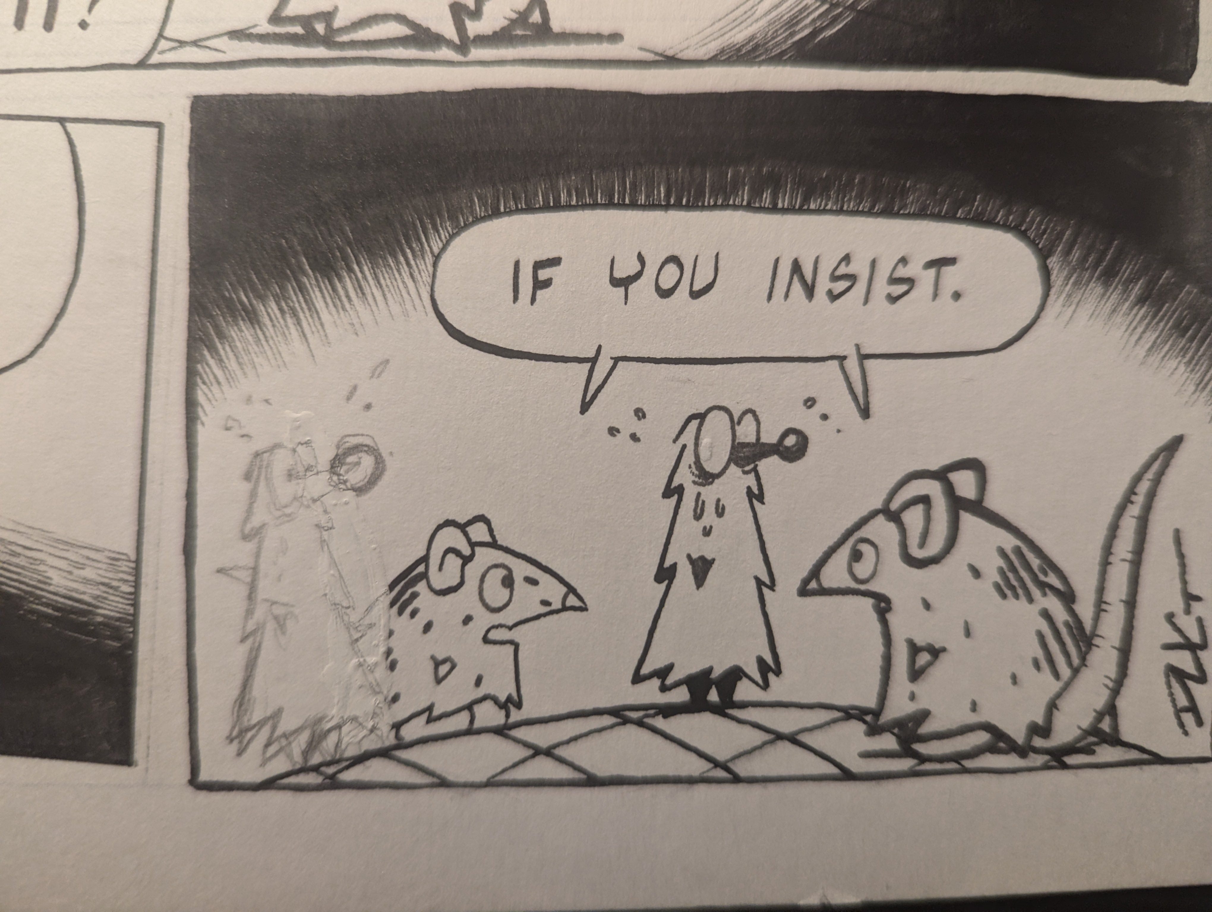
Finally, the one thing I did want to preserve in this comic was this visual flow the word balloons made. I’m really conscientious of white space in my comics and I try to use it to manipulate and guide the reader’s eye through the dialogue. For this reason, usually the only white thing in my comics is the speech bubbles - with the little exception of some characters’ eyes. Speech bubbles are big enough they hold the most visual weight in a given panel. And given the simple palette I use for these comics, it would probably be more distracting for my characters’ eyes to be any other color anyway.
Compositionally, it’s important to remember that speech bubbles are a design element. A reader isn’t necessarily prone to follow English reading order in a panel or page, they are prone to read whatever dialogue balloon is closest to the last. Even though I want to be as noncommittal as possible, it’s important to remember that the reason I’m doing that is to make the best possible comic. In that spirit, it was really important I preserve what I was doing with the speech bubbles in that first penciled draft. It’s rare I get to play around with the readers attention to this degree. I especially like the spacing between the last two bubbles. It would probably be too much space anywhere else in this particular comic, but the reader has nowhere else to go and I think it creates a slight pause.
I really hope I can take this kind of energy into the rest of what I make in 2025. We’ll see! I really wanted to look back at 2024 and look forward at 2025 in this post… but I’ve talked enough for one week. We’ll deal with all that good stuff next time! Have a great week everybody! And if you are near NE Ohio, good luck with all that snow!
Your editor-in-chief, Doug

Thanks! I learned something!